UNDO
—
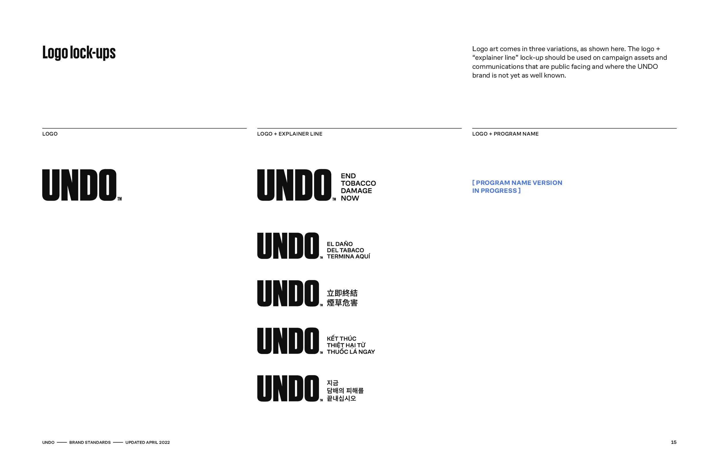
Branding and identity system
The Challenge
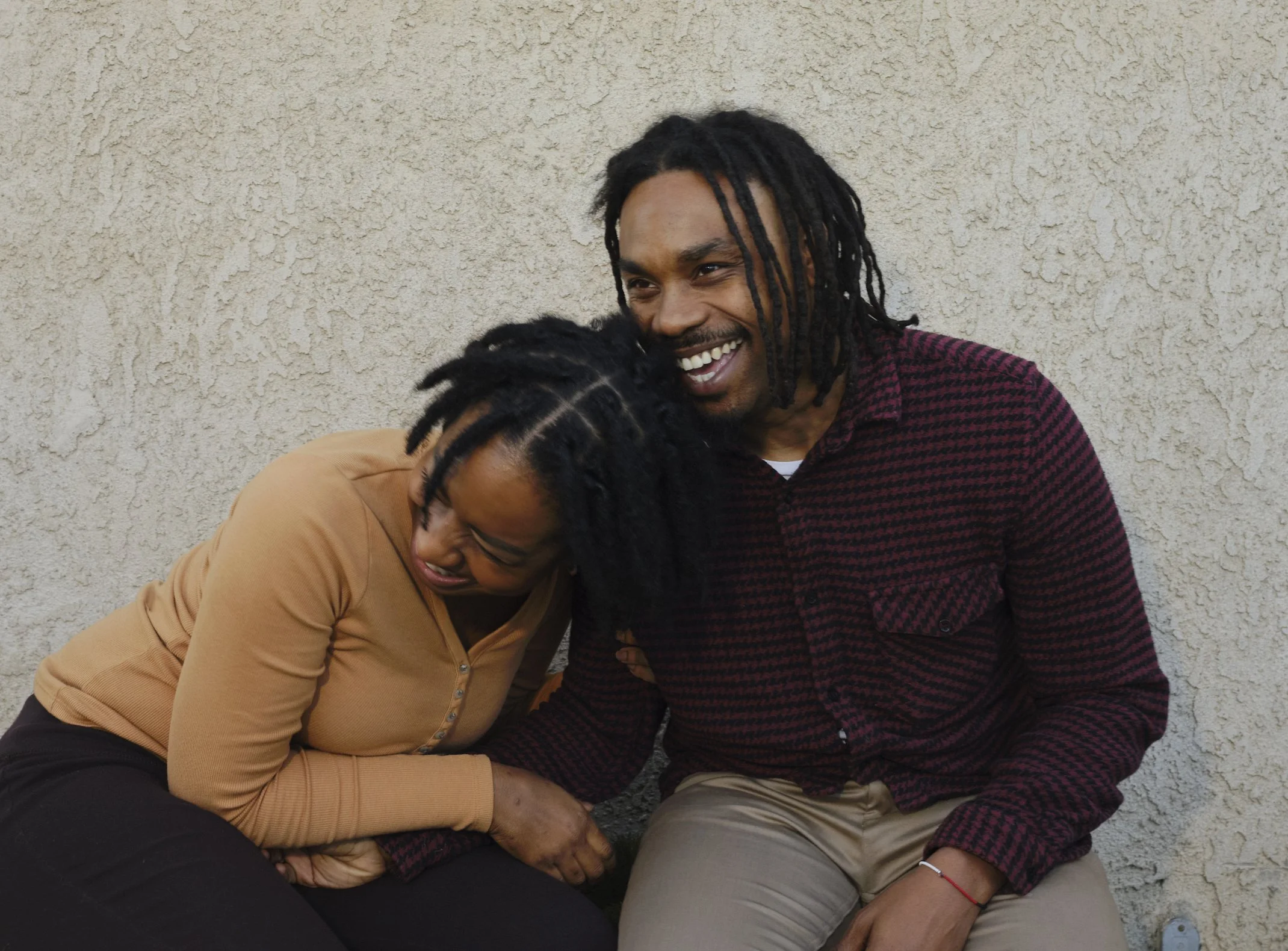
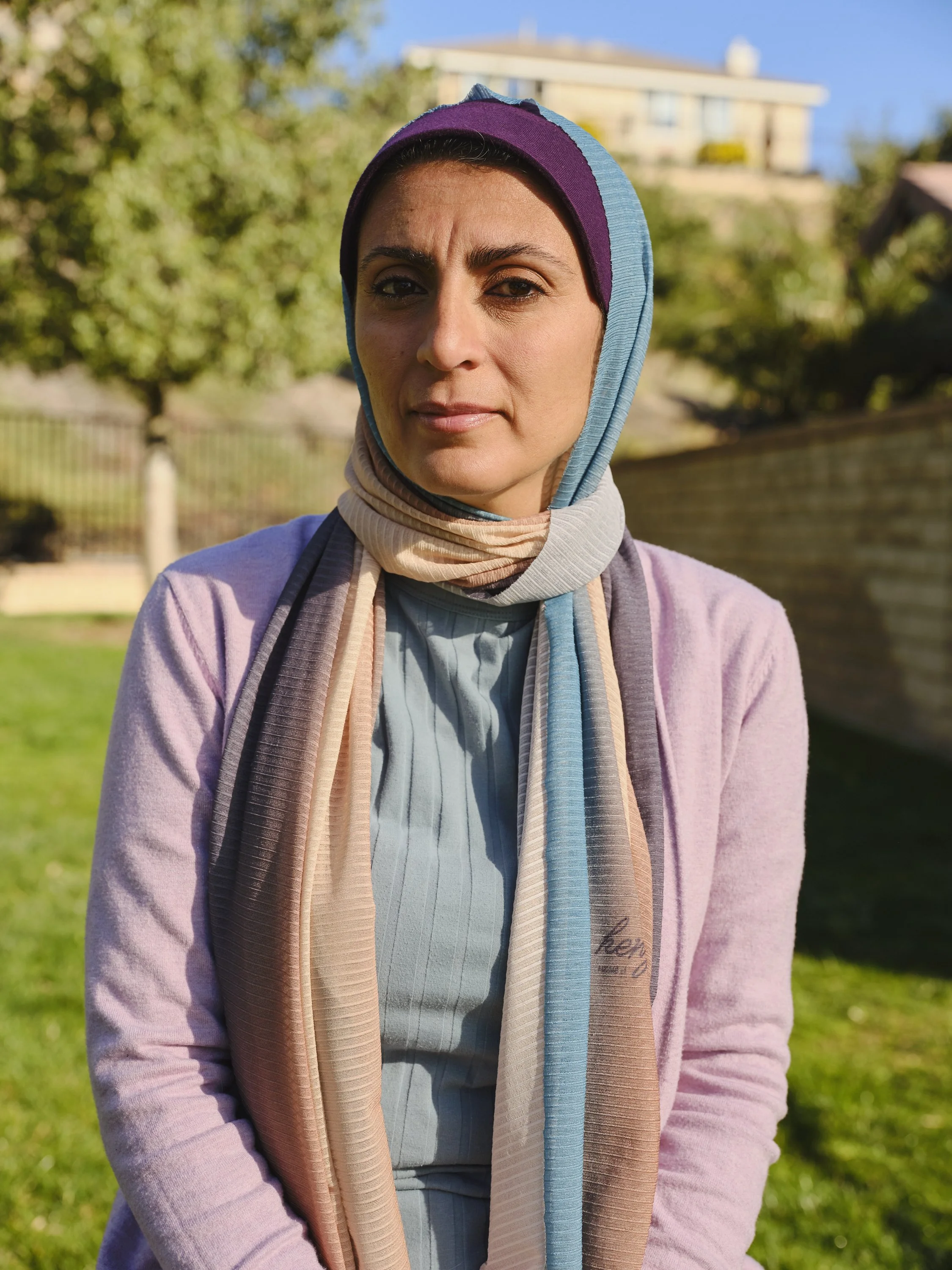
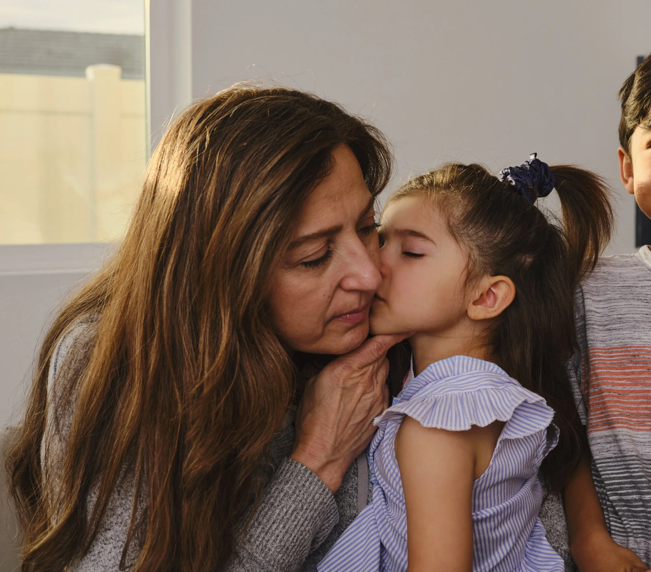
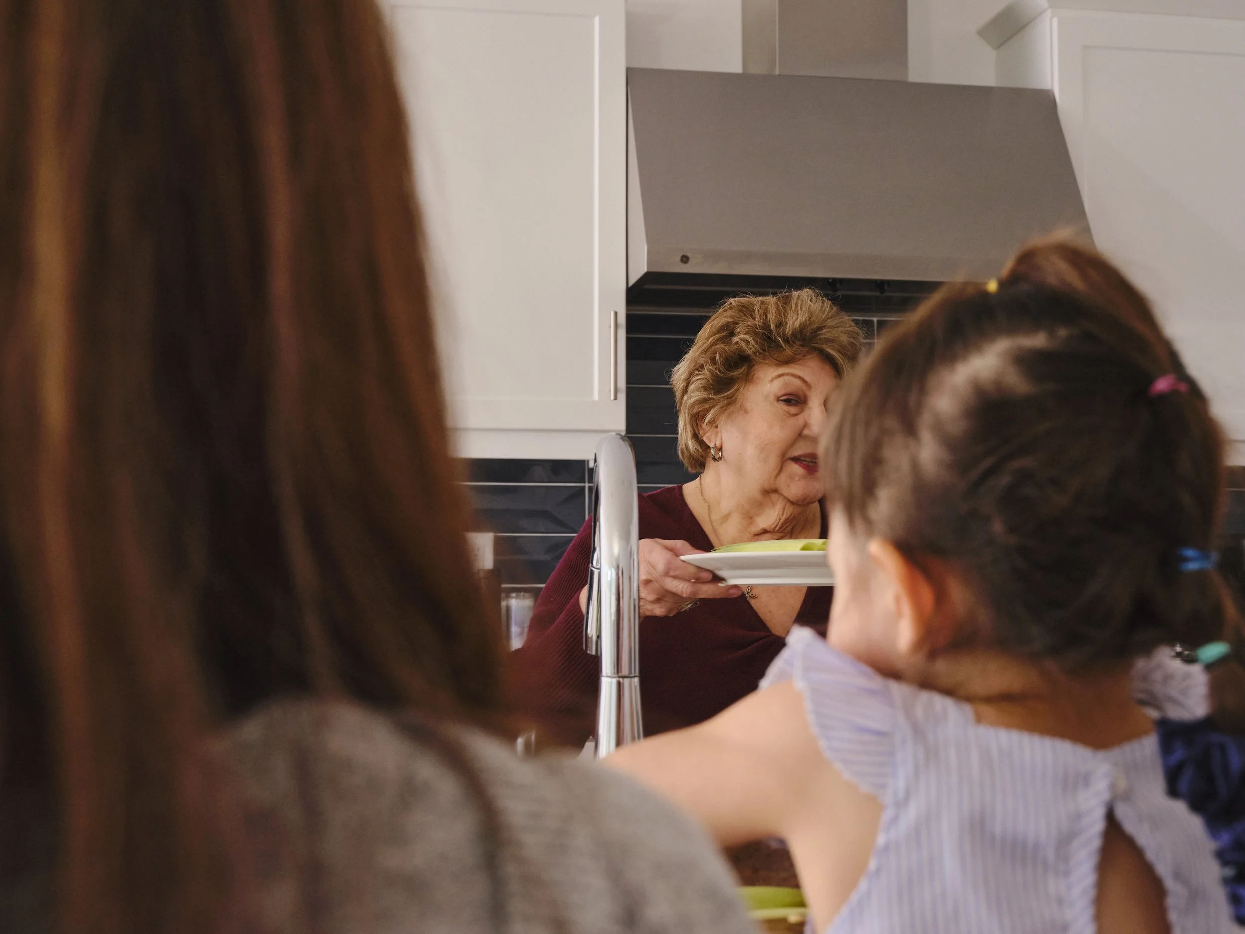
After many years of campaign work for California Tobacco Control Program, Duncan Channon was asked to create a unifying brand platform. This included a renaming (UNDO), comprehensive brand standards, a photography library of real Californians, and original illustration.
Result
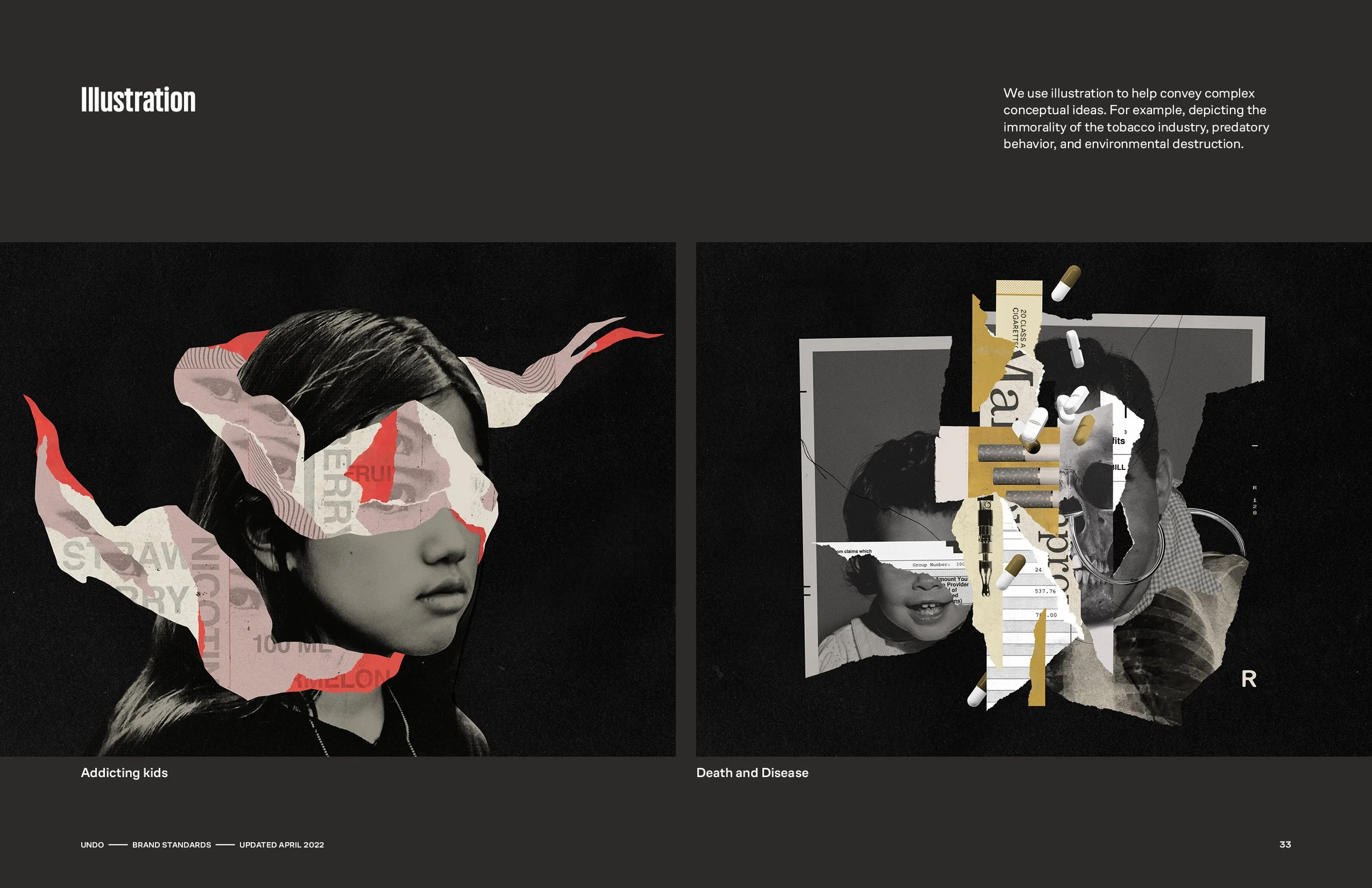
The UNDO brand was designed to cut through noise — direct and powerfully simple in its primarily black-and-white world, with color used sparingly for emphasis. Documentary-style photography introduced warmth through real human moments, while conceptual illustrations visualized the tobacco industry’s harm and deception — creating a balance between fact-driven storytelling and emotional resonance.
Creating the UNDO brand meant thinking beyond the identity itself. We anticipated the many campaigns that would follow — each potentially requiring its own expression — and built a system flexible enough to adapt while remaining cohesive across executions.
—
Role: Brand Design, Art Direction
Scope: Identity, Illustration, Photography, Guidelines
Creative Directors: Anne-Elisco-Lemme and Michael Lemme / Co-designer: Darlene Gibson / Illustration: Mike McQuade / Photography: Oriana Koren


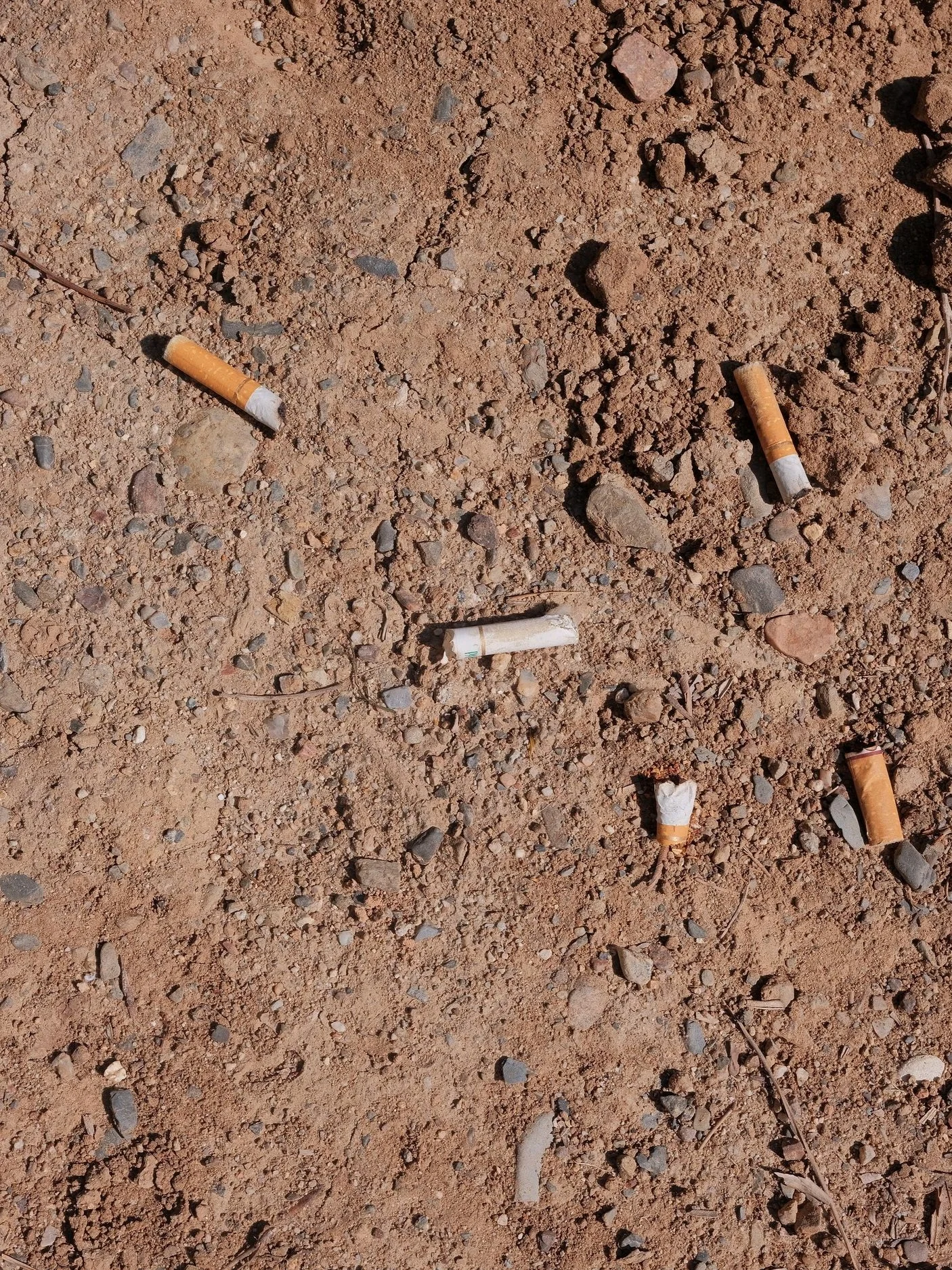
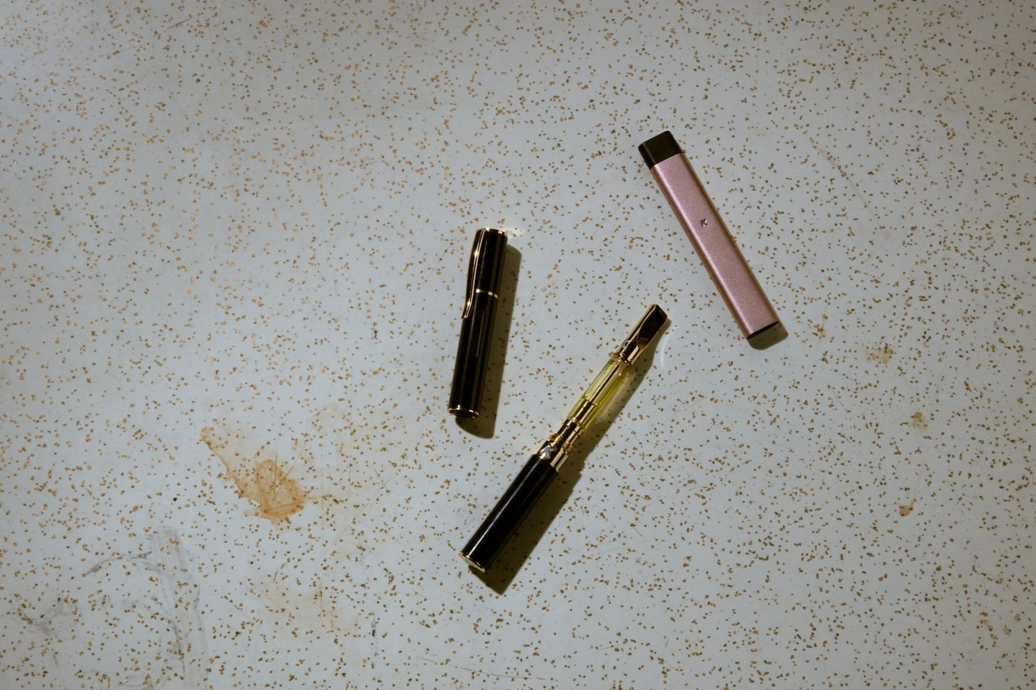
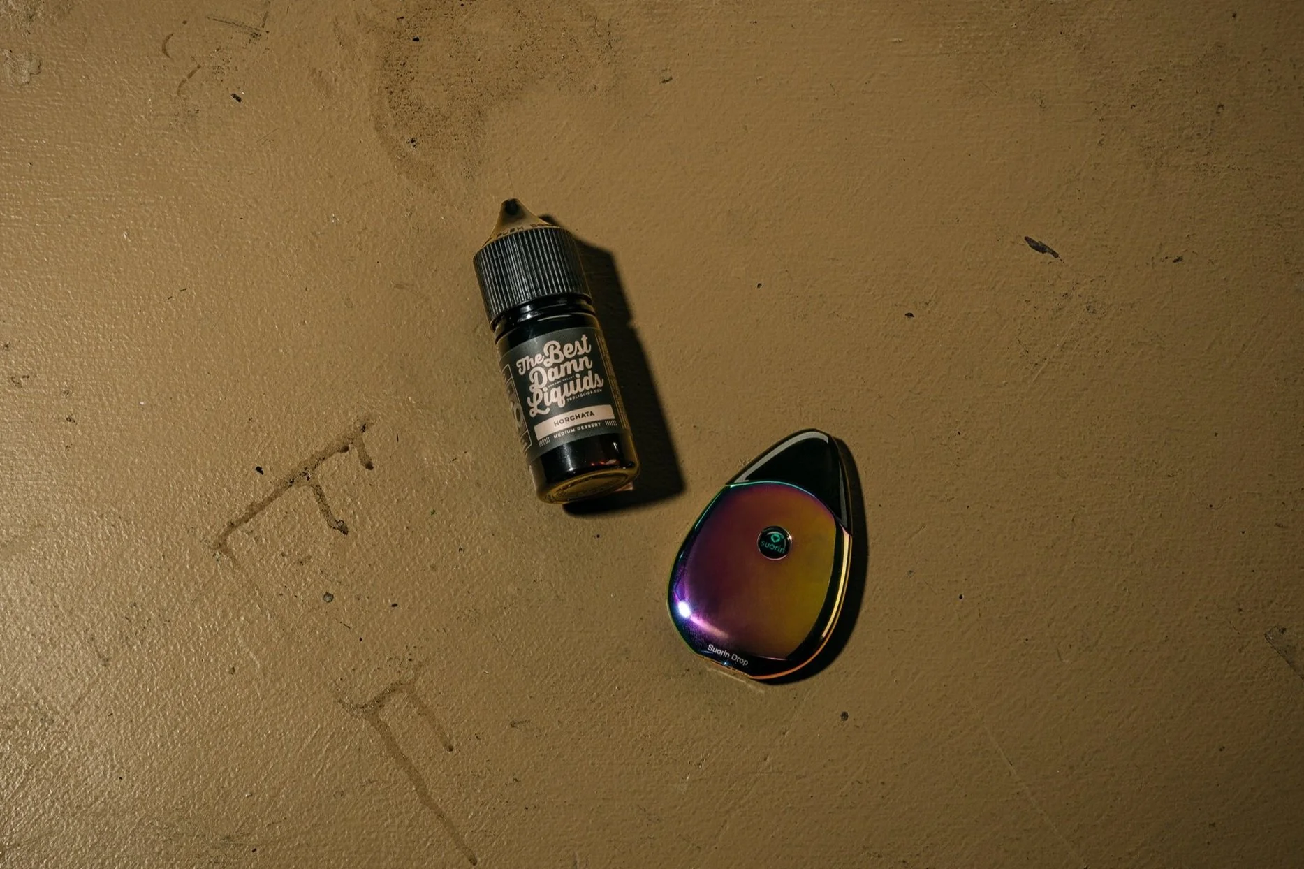
Product photography is meant to be especially gritty and unappealing, shot on stained or dirty environments with a high contrast flash.